Macrix Technology Group – Corporate Identity
Role
in-house designer
Year
2025-2026
Deliverables
visual identity concept, 25th anniversary logo, animations for website and video, icons, 3D illustrations, large scale field game with magnetic pieces
Timeline
4 months
The Visual Identity Concept
The company adapting to change


25th anniversary logo
Infinity loop
The logo carries another layer of the concept. Through the 25th anniversary work, the recurring motif was a glass ribbon bent into an infinity symbol. That form is built into the mark itself – the lower half of the 2 transitions into the 5, and the two meet as the infinity loop. The idea was continuation: a company that keeps adapting and means to keep going, in an organisation with high employee retention.


150mm – ∞

17mm – 150mm

9mm – 17mm

black

brand colors

white

silver
Variety of colors
Macrix's colours are black, red and white, and the anniversary mark uses them directly. The silver variant was added alongside these, since a 25th anniversary is traditionally associated with silver.
Assets for the new website
Animation sets


Product illustrations
Two illustrations, one for each of two Macrix products, made in the same glass material language as the rest of the identity. Each model is built from forms that represent the attributes of the product it stands for.
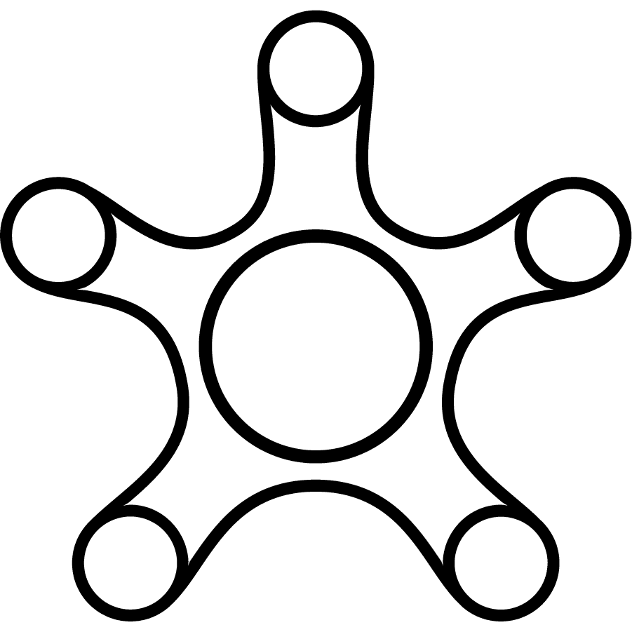


The icon set is built from the same 0 and 1 particles the identity starts from, joined by bent curves that carry the fluidity of the glass into a simple line style.
The Game


25 years of Macrix history
The Game was a large physical board – 5 metres wide and 2 high – printed on cardboard panels and installed for the anniversary celebration near Poznań. Its illustration is a long swirl of glass with the years marked along it, working as a timeline. Participants placed pieces in their right spots on the board: each piece a person who joined Macrix at that point, a project, or an important client.